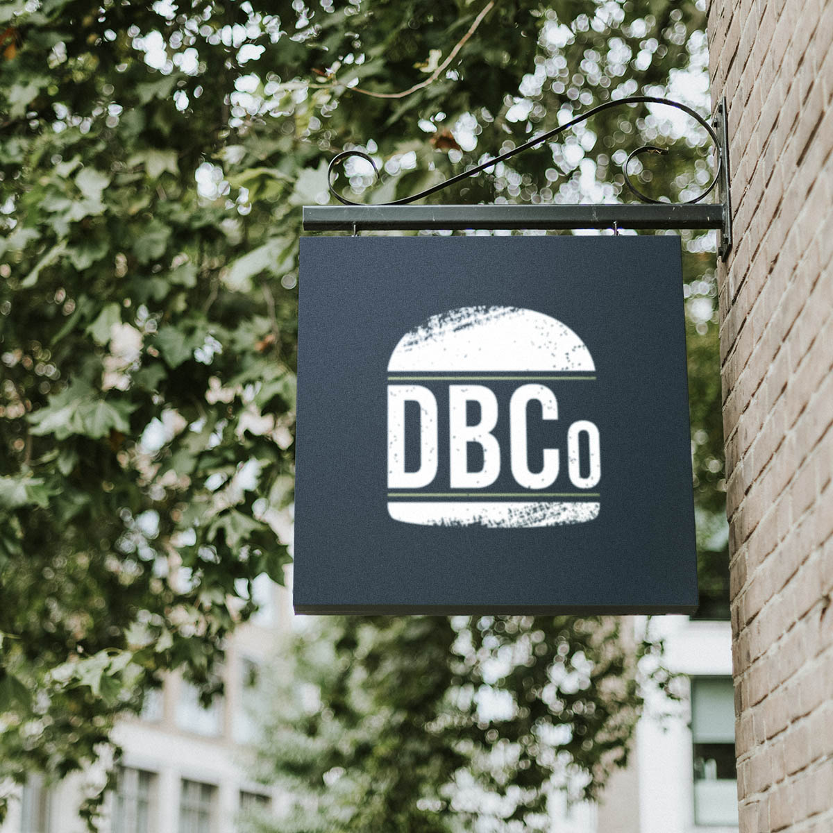
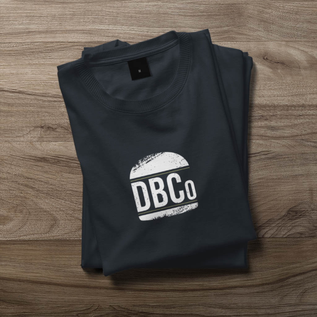
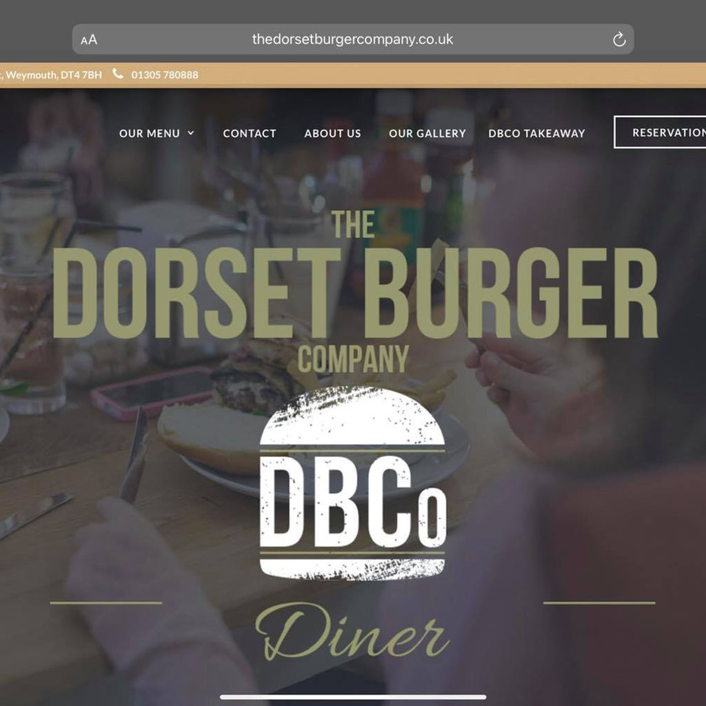
Logo Design For The Dorset Burger Company

Date
January 13, 2023
Category
Logo DesignAbout This Project
The Challenge.
With The Dorset Burger Company going strength to strength and more physical materials including t-shirts and menus being made for the team, a new logo was requested.
The Solution.
I really wanted to emphasise the grand scale and quality of the burgers served which led to a royal blue and touch of gold being used along with white for the colour scheme. Using the name shortened to ‘DBCo’ as an element of filling allows a natural scaling of the burger and logo. The grunge effect was added due to the wooden, homemade feel to the restaurant itself; bringing together the logo, restaurant and food as one.